“Does it go in the ‘keeper’ pile or does it go in the ‘discard’ pile? That’s the first question the selection committee members are probably going to ask, because it’s likely that the reviewers are staring at a pile of submissions much larger than they can reasonably handle.” ― Tom Sant, AUTHOR OF Persuasive Business Proposals
Proposals. For those of us who build these, it’s a love/hate relationship. The saying goes, “proposals rarely win pursuits, but they can lose them in a heartbeat.” We know proposals need to be compliant. We know that a clear strategic approach can be a differentiator, and we know showcasing an “A” team and relevant project experience can be the difference between shortlisted and not. But one thing you may not realize is the importance of your proposal’s design. Design can help your proposal stand out from your competitors and leave the selection committee with a positive impression of your team. If you have taken the effort to present the information above in a clear and precise way (and with benefits and proofs), you are steps closer to a great AEC proposal that wins.
1. Wow them from the start
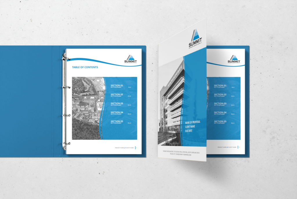
You only get one chance to make a first impression. First impressions last well beyond the moment thanks to the primacy effect, which means when someone experiences something before other things in a sequence, they remember the first thing more. Wow them from the start with a unique and impressive cover design. You can feature impactful photography, your team, or think outside the box. The first glance at your cover will decide if they want to pick up your proposal and read what you’ve got to offer.
2. Stand by your brand
This goes without saying, but it is a nice reminder — adhere to your company’s brand standards. You may be tempted to match your proposal’s design (colors, fonts, style) to the brand of the client, but in doing so you lose familiarity with your own brand. Chances are you are submitting a proposal to a repeat client, or a client you have pursued in the past. You want them to recognize your proposal just by looking at your document. Using your brand standards as a guide builds brand familiarity (maybe add a link to this word to my other article) and makes it easier to pick out your proposal from your competitors.
3. White space is your best friend
Make sure each element in your proposal, whether it’s your logo, text, images, infographics, tables, or any other element, has enough white space around it. You want your designs to breathe, to make your proposal clean and easy to read. One way to ensure white space is by setting up guides to make a visual representation of how far apart the elements should be as well as the margins around the edges of your pages.
4. Features tell, benefits sell
When I first started building proposals 10 years ago, I attended an amazing training on proposals. The most important thing I learned is to focus on the benefits, not the features of your business. If you can read a selling point and say, “Who cares?”, it is a feature. Many of the selection team members may not necessarily be experts in the AEC world, so you need to TELL them why your features will benefit the project. What keeps your client up at night? How can choosing your company help solve those problems? Answer these questions with bold benefit statements and you are well on your way to winning the pursuit.
5. Pay attention to your fonts
Since a proposal is usually text-heavy, you’ll want to make sure the information is legible. Sticking to your brand fonts is important as they were developed with legibility in mind. Add hierarchy to your text by using a different font for headings or using a different weight of the font used in the body. This makes your proposal visually appealing and easy to read.
6. Be thoughtful with layout
Most proposals are built in the standard portrait layout, but have you ever tried to read a text-heavy document in portrait layout in your Adobe Reader? With more and more proposals moving to digital submissions, try out a new layout — landscape. It’s easier to read on screen because you are able to fit more information on one page. It’s also unique and will help your proposal stand out from your competitors.
7. Use thoughtful graphics
Since proposals are traditionally very text heavy, and your selection committee is likely reviewing a bundle of proposals in addition to yours, use infographics to break up text and help the selection team members visualize your key information easier. Highlighting important information in a more compelling way is another way to be distinct and stand out from your competitors – and also helps draw the reader’s attention to what you want them to see!
8. The proof is in the pudding
You’ve got your benefits statement nailed down, now it’s time to prove you’ve done it before. Make your entire proposal more compelling and convincing by incorporating proofs. A few examples of proofs in an AEC proposal are project or industry-specific awards, case studies highlighting quantitative data on cost and time savings, and stellar client references. Include supporting photography or graphics to make them more impactful.
9. End with a call to action
You’ve followed all the steps above and you are ready to finalize your document. Now is the time to compel your selection team members to act. Ending the document with a clear call to action help get the selection team members motivated to score your company with high marks.
And there you have it, nine tips for building great AEC proposals that win. Utilize these steps in your next proposal and reap the rewards.
_______
Ashley Dailey is the Senior Graphic Designer on the Threaded Marketing Group team. She has over 15 years of graphic design and over 10 years of AEC proposal experience. She has worked on pursuits ranging in size from $1 million to $1 billion across the United States and is considered an expert in AEC proposal development in Georgia.


